Candlestick Chart
© Chart photo copyright by CHARTIST blog
It is similar to bar chart as far as price data is concerned
as candlestick charts also included all four important price data like Open,
High, Low, Close. Candlestick charts can be used in any time frame from 1
minute’s to5 minutes to 15 minutes to 30 minutes to 1 hour to several hours to
daily, weekly monthly and yearly.
Same like in bar chart, here also in candlestick chart, and
each candle represent the particular one period, suppose you selected the
candlestick chart in 30 minutes time frame than that each candlestick will be
shown the prices of Open, High, Low and Close of that particular 30 minutes.
But there are some more details in each candlestick
formation: it is called Open Candle and Closed Candle
Open Candle : Open candle means if the closing price is
higher than opening price of that particular candle than it is called “Open
Candle” and it will be shown in Blue color by default.
Close Candle : If the price is closed lower than the opening
price of that particular candle than it is called “Closed Candle” and it will
be shown in Red color by default.
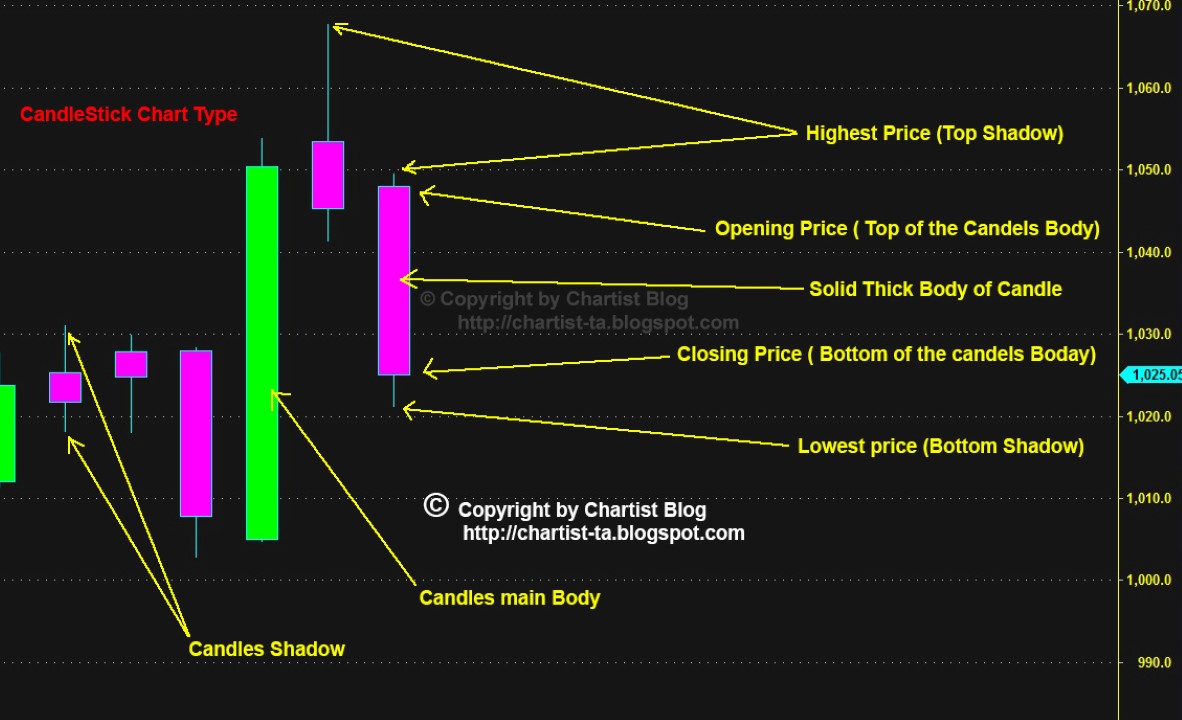
Each Candlestick made of two components, one is Body mean
the thick solid vertical bar just like a candle and another component is the
shadow of the candlestick.
Candle Body : It
looks like thick and solid bar just like a candle and it consist the open and
close price, means the top of the solid thick body in each candle represent the
opening price of that particular time frame and in a same way the bottom of the
solid thick body of each candle represents the closing price.
Candle Shadow : Most of the time each candle have the extra
vertical thin line which is coming out from top & as well as from bottom of
the solid thick body of candle, these vertical thin lines called shadow (but I
personally call the top line is flame of the candle and bottom line same as
shadow, I think it makes more relevant to candle, than both are shadow, I think
most of you will agree on my logic) anyways back to the learning, the thin vertical line or shadow (or flame in
my language) on upper part of the solid thick body is represents the high price
for that particular time frame candle and in same way the thin line or shadow
below the bottom of the solid thick body of candle represent the low price of
that particular time frame of the candlestick.
Candle stick chart is one of the best for technical analysis
in comparisons to above two i.e. Line chart & Bar chart. As there are many
candle patterns which gives the clear view to the analyst which way is the
movement going to happen.
by,
C H A R T I S T